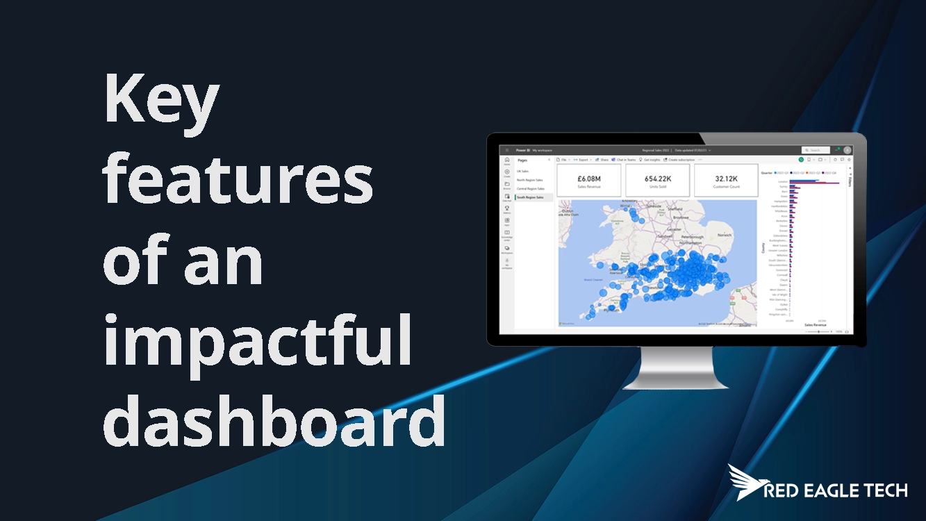
5 Key Features of an Impactful Microsoft Power BI Dashboard
Businesses produce so much valuable data, and it's important that something useful is done with that data to ensure they stay ahead of the game. A well-built dashboard can provide you and your team with visually pleasing, easily accessible and actionable insights to help drive business growth and success. You might be looking to enlist the help of a data specialist to create a dashboard for you. But what can you actually get from a dashboard, and what features might you wish to ask for in yours? In this article, we take a look at 5 key features of an impactful Microsoft Power BI dashboard.
1. Interactive visuals for user engagement
A Power BI dashboard needs to be interactive and visual, and it's built to let you do this intuitively and easily. Firstly, static graphs and charts are no longer the thing – Power BI enables users to engage with real-time data. It also offers a set of versatile visualisations, from bar charts and line graphs to heat maps and geographical maps, enabling you to choose the best presentation for your data. These visuals enable you to build in interactive features like drill-downs, cross-filtering and tooltips. Users can explore the data they want to see, at their own pace, and uncover insights that they could not get from static data.
2. Drill-through for deeper insights
Another key feature that makes Power BI dashboards extremely useful to businesses, is the drill-through functionality. Drill-through allows users to explore specific aspects of their data by clicking on a data point in a visual. It's like peeling back layers to reveal more detailed information. With drill-through, you can design your dashboard to provide a high-level overview while allowing users to delve deeper into specific dimensions or categories. For example, if you have a sales dashboard showing regional sales figures, users can drill through to see sales by individual products or by different time periods. This feature enables users to investigate data anomalies, identify contributing factors to trends, and gain a more comprehensive understanding of the data.
3. Filters to tailor the user experience
In Power BI, filters allow the user to get a deeper understanding of the data they are presented with. They enable users to customise dashboards based on specific criteria, meaning they can focus on what matters most to them. The other great thing is that Power BI's filter capabilities go beyond the basics, meaning you can implement single or multi-select filters, data ranges and advanced measures to create dynamic data subsets. By giving users the ability to slice data according to what they want to see, they can extract insights most relevant to their role, increasing understanding and efficiency.
4. Success metrics with KPIs
KPIs provide a clear, concise representation of performance against predefined goals. Integrating KPIs into your Power BI dashboard offers an instant assessment of how well your business is performing. With Power BI's built-in KPI visual, you can track metrics such as sales targets, customer satisfaction scores, or operational efficiency. Being able to visualise KPIs alongside other data gives you rich context for informed decision making. Moreover, you can set conditional formatting to dynamically change the appearance of KPI cards based on performance thresholds, drawing immediate attention to critical areas. Our Software Engineering team specialises in creating custom KPI dashboards tailored to your business objectives.
5. Tell a story with your data
An impactful Power BI dashboard tells a compelling data story. Assemble your visuals, filters, and KPIs in a logical sequence that guides users through insights, observations, and actionable takeaways. Text boxes, images, and custom shapes to annotate your dashboard provide context and guide users' attention to key findings. By weaving data into a narrative, you create a more engaging and memorable experience for your audience. This storytelling approach is particularly valuable when presenting to stakeholders who may not be familiar with all the technical details of the data.
Businesses produce a tonne of data on the daily and ensuring you do something useful with this data will be the foundation to the success and growth of your business. Power BI's user-friendly, insightful, visually pleasing and intuitive capabilities will give you exactly what you need to do that. Our friendly, knowledgeable team at Red Eagle Tech are here to help you with Power BI dashboards and reports – whatever your requirements. Our Business Intelligence solutions can transform your raw data into actionable insights that drive growth.